Background:
A community-driven project, this exercise deals with how I would plot a Fintech app’s flow and user experience. The words written by the designer, although generic, weren’t clear and compelling enough for the user to take action. I made sure the words were easy enough to understand and required less thinking for the user.
Who would use this app?
Millennials who want to track and change their spending habits. They’ve used other fintech apps but the UX didn’t live out to their expectations.
Note: Screen on the LEFT is the BEFORE and the one on the RIGHT is the updated version.
Welcome screen
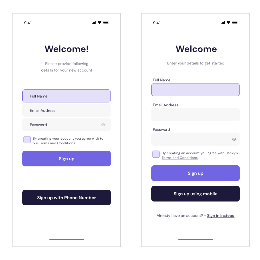
The welcome screen has some issues with the placeholder text, which may create confusion to users. Instead of placing the usual text inside the form, I moved the labels above the box and left the box blank. Research from NN/Group reveal placeholder in forms are harmful and only confuses users.
I’ve also edited and simplified words to make the registration process as smooth as possible, if this page would be tested to users. Button copy is also simplified in this example.
Sign in screen
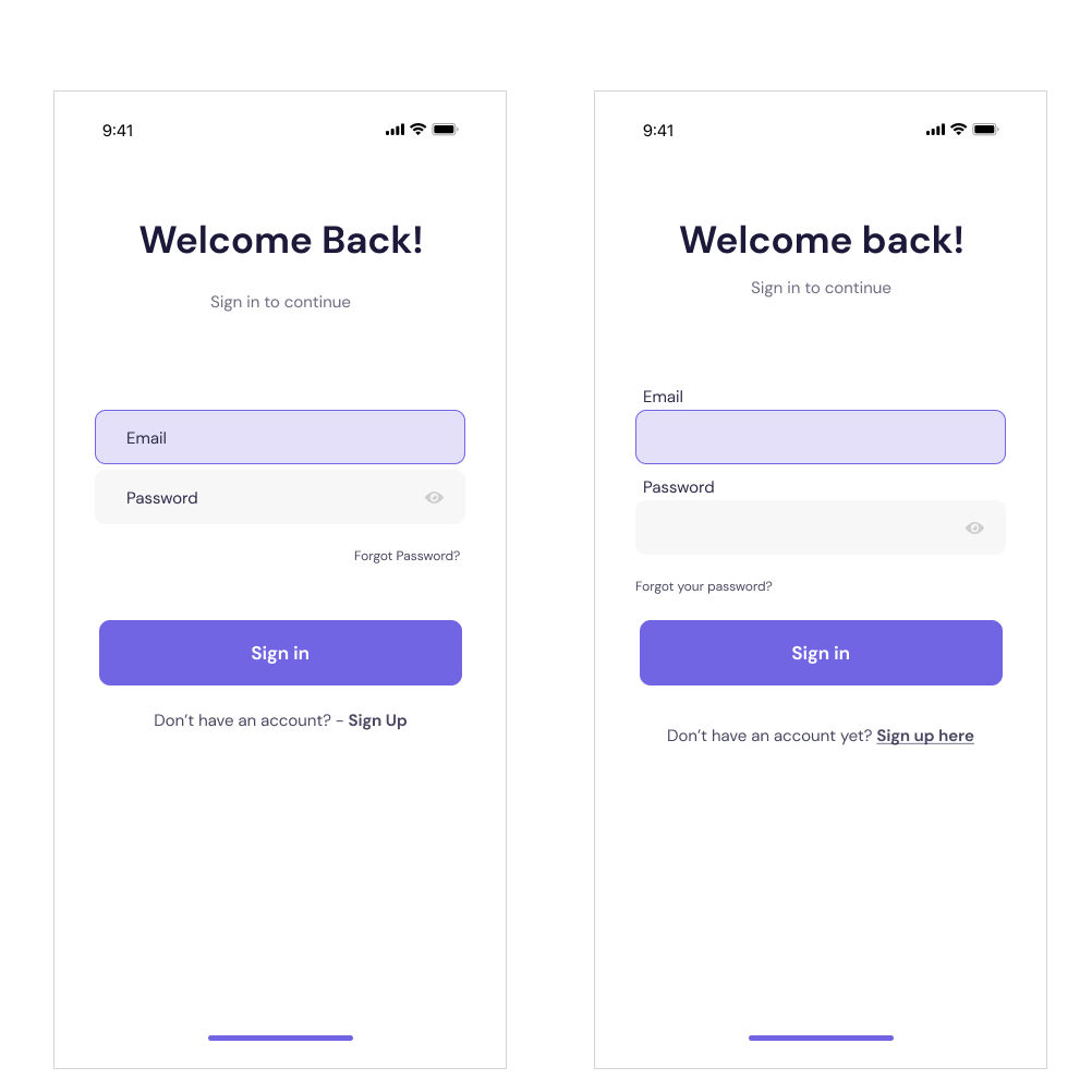
Same treatment as the previous screen, but made designs cohesive and moved labels above the form box.
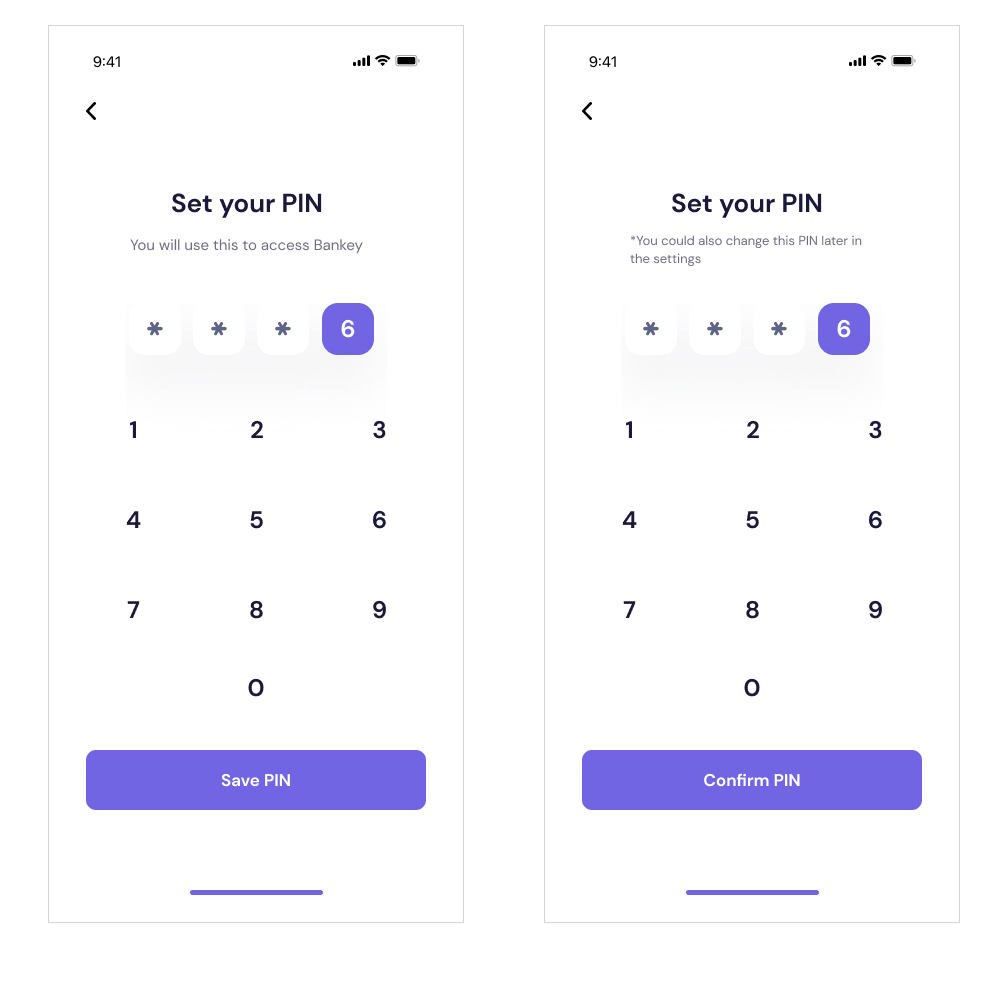
Replaced ‘save PIN’ to ‘confirm PIN’ and added a prompt telling the user that they could change these later in the ‘settings’.
2FA for added security
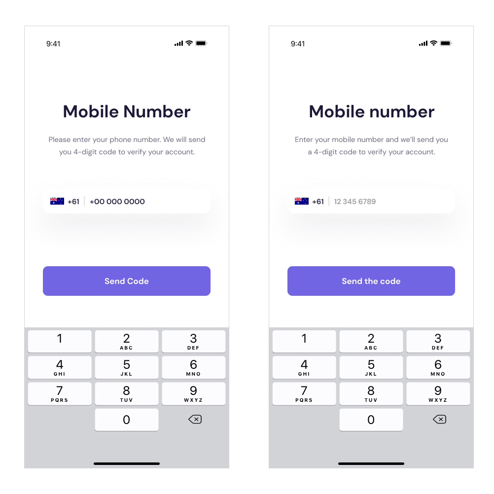 Changed headings from Title Case to Sentence case. This makes copy readable and help the user move forward to the next step. Added contractions (we will to we’ll) to convey a conversational yet stern approach, since the app will be taking care of their money.
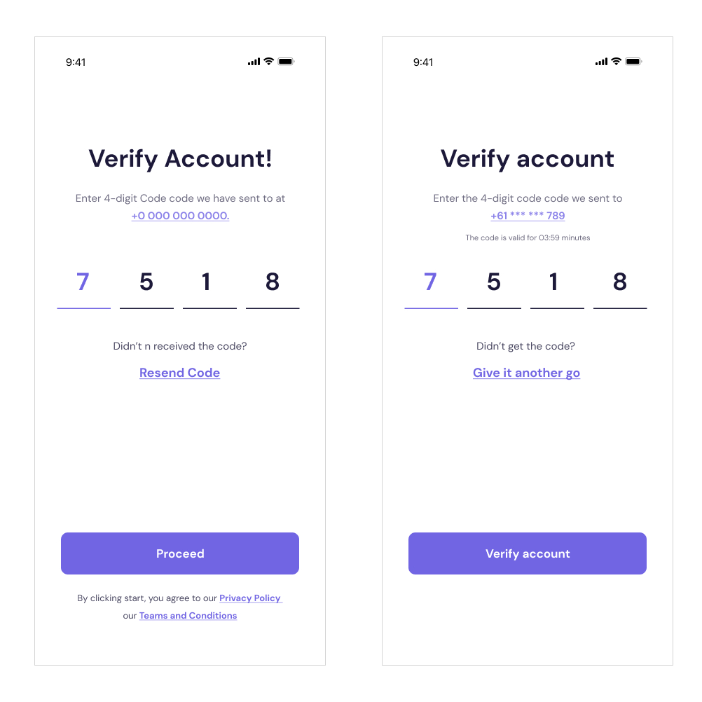
Blurred out the middle portion of the mobile number for security reasons. I added a countdown modal below the mobile phone number to prevent hackers from exploiting the app. CTA copy is replaced with the phrase “verify account” to match headings and give it a more driven tone.
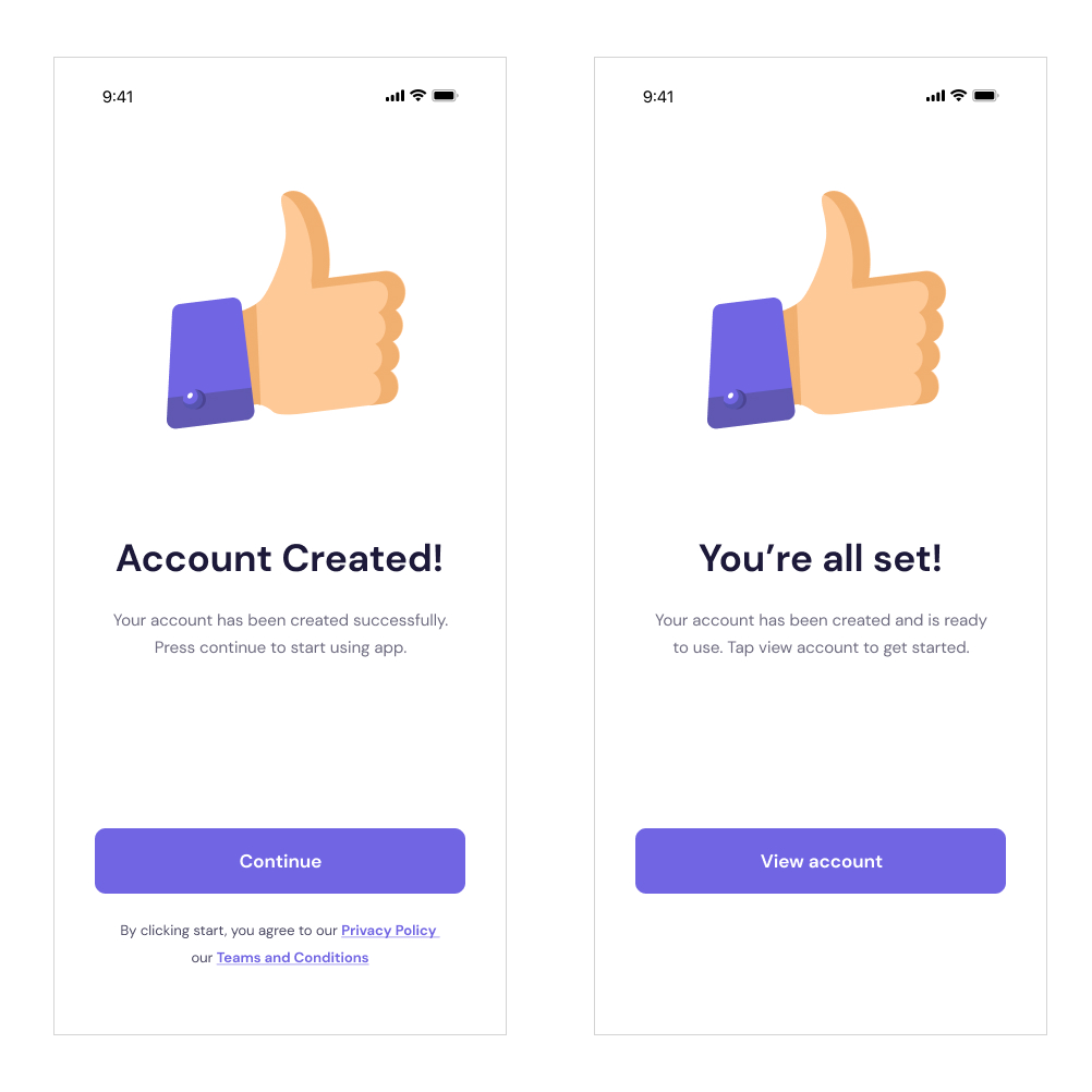 “Microinteractions” convey a sense of accomplishment to the user. The thumbs up illustration along with casual tone in the copy validates their completion of the onboarding and sign up process.
Dashboard
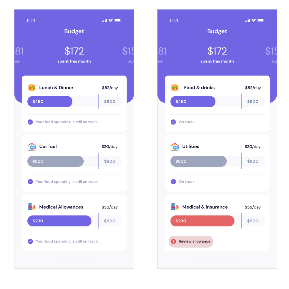 Corrected the labels to match the icons set by the design team. Lunch and dinner doesn’t match up, and now I’ve replaced it with Food and Drinks. The user could also customise labels according to their preferences.
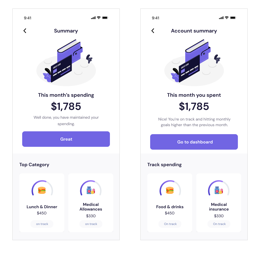 Help texts and microcopy delights users when done right. For this, my hypothesis led me to use words like, “nice!” to validate good behaviour via good spending habits. This leads me to believe it will delight users, prompting them to use the app daily, and creating good habits along the way.
In closing
I’ve omitted some screens to give a glimpse of my thought process and why I choose certain words and design cues to help users achieve a desired state. I made sure there were no biases that crept into this design thinking exercise.